Hit enter to search
CLOSE
When referenced in an online context, Visual Merchandising refers to the practice of designing and optimizing digital visual elements—such as product photos, videos, page layouts, color schemes, and signage—to attract online shoppers, guide their browsing journey, and drive purchases. Unlike traditional Visual Merchandising (which centers on physical store spaces), its core goal is to turn electronic screens into engaging, trust-building "online storefronts" that make up for shoppers’ inability to physically touch or examine products. Whether you’re scrolling a brand’s homepage and spotting eye-catching hero banners, zooming in on product detail shots, or watching short clips of a backpack being used, you’re experiencing how Visual Merchandising works in an online setting.
Strong Visual Merchandising for online audiences isn’t just about "looking good"—it needs to solve the unique challenges of online shopping (like the lack of physical interaction) while keeping browsing easy and persuasive. Here are the key components:
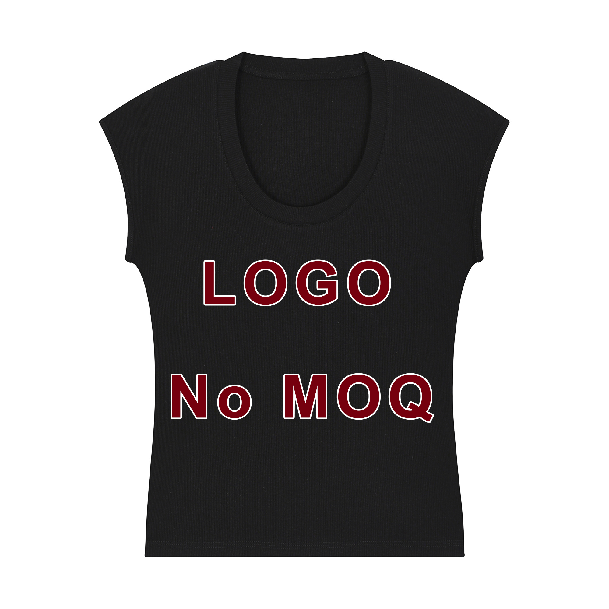
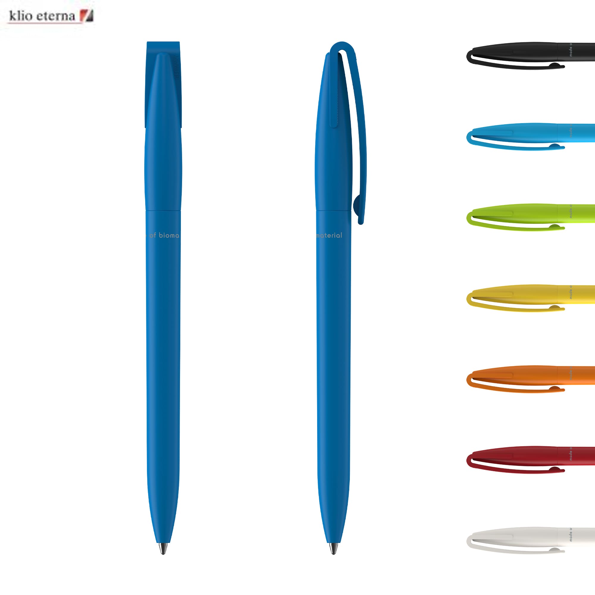
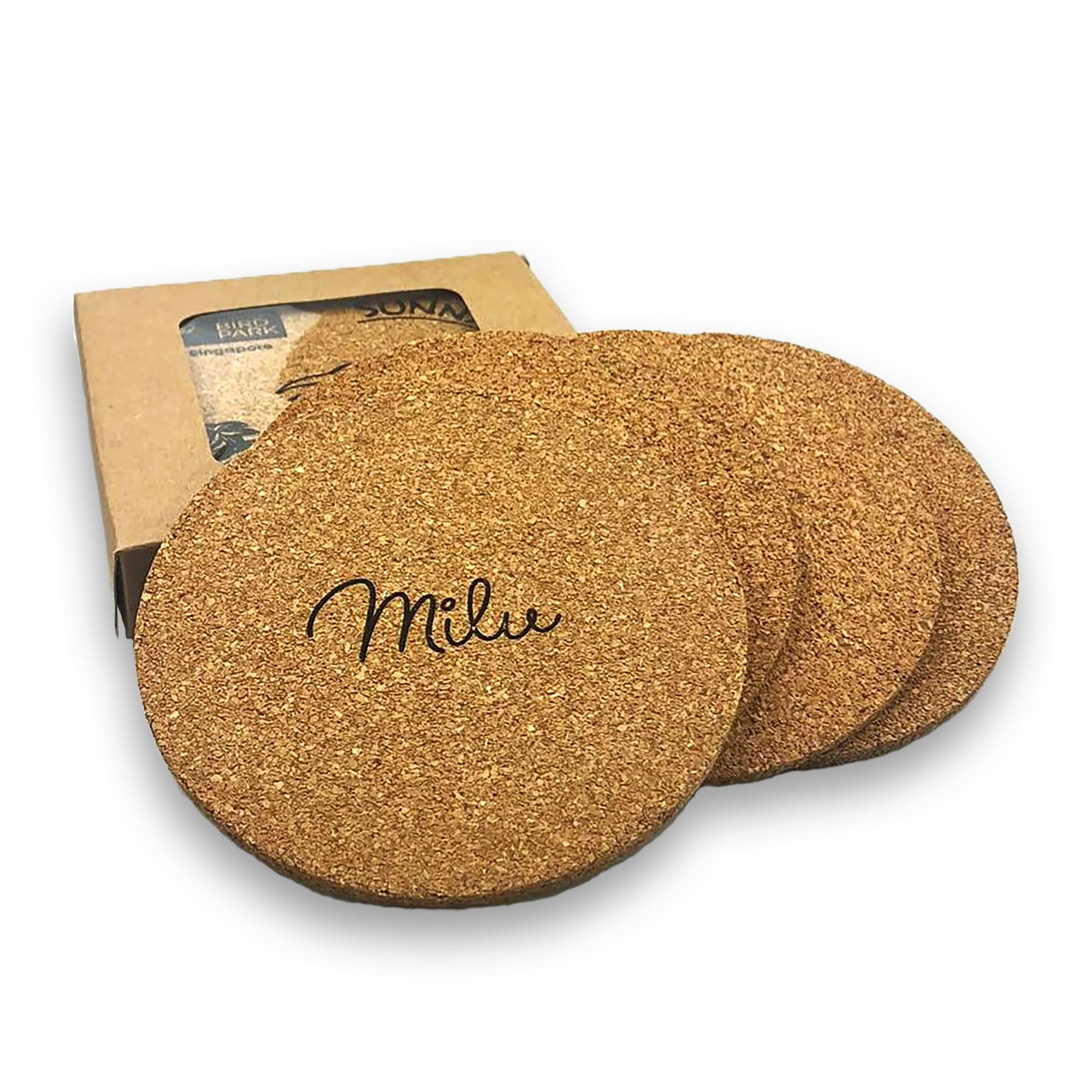
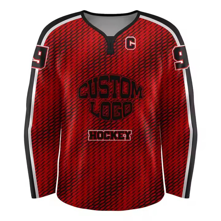
Product photos and videos act as the "tactile substitute" for online shopping—they’re non-negotiable for building trust. High-quality imagery must be clear, consistent, and thorough: For a t-shirt, this means front/back shots, close-ups of fabric texture, and photos of models in different sizes; for a mug, it includes multi-angle views plus a shot of it holding coffee to show scale. Blurry or poorly lit photos should be avoided at all costs—they make shoppers question product quality.
Online shoppers quickly give up if they can’t find what they want fast. A smart layout uses visuals to streamline their path: The homepage hero banner should highlight key products (e.g., "Summer New Arrivals") or promotions; category pages need clear, image-based filters (like "Black Backpacks" with thumbnail previews); and product detail pages should put critical info (price, "Add to Cart" button) "above the fold" (the part of the screen you see without scrolling). No one wants to scroll repeatedly to find a buy button—core visual elements and action options must be instantly visible.
Consistent visual styling (colors, fonts, photo tone) makes a brand easier to recognize and more trustworthy. For example, if a brand uses soft pastels and natural lighting in its photos, this style should stay consistent across all pages—never mix in bright neon images. Even small details count: If product photos have rounded corners, banner images should follow the same design. Visual consistency sends shoppers a clear message: "This is a professional, reliable brand."
Online shoppers often struggle to imagine owning a product—so visuals need to show them exactly how it fits into real life. Scenario-based content places products in practical contexts: A tote bag paired with a laptop and books to highlight its use for work; a backpack shown during a hike to emphasize durability. Short videos work even better: A 10-second clip of a water bottle being opened or a shirt being washed can answer unspoken questions and reduce hesitation to buy.
Most online shopping happens on mobile phones—so Visual Merchandising must be tailored to small screens. Here’s how to adapt:
Simplify layouts: Avoid cluttering mobile pages with too many images; focus on 1-2 core visual elements (like a single featured product) instead of a grid of 5 items.
Optimize image size: Large, slow-loading photos drive shoppers away—compress files to keep load times fast while preserving clarity.
Enlarge action buttons: Buttons like "Add to Cart" or "Next" should be big, bold, and placed where thumbs naturally reach (the bottom or middle of the screen).
Unlike physical retail, online businesses can track how well their Visual Merchandising performs—use this data to refine your approach. For example:
If a product with "model-worn" photos has a 30% higher "Add to Cart" rate than the same product with only flat lay shots, use more model photos.
If a homepage banner highlighting a sale gets more clicks than one featuring new products, prioritize sale-focused visuals during promotion periods.
Try A/B testing: Show half your shoppers a blue "Add to Cart" button and the other half a green one—see which drives more purchases.
For online businesses, Visual Merchandising is a "silent salesperson"—it bridges the gap between "browsing" and "buying" by making products more tangible, browsing more convenient, and brands more trustworthy. The key isn’t just creating attractive visual designs, but creating designs that address shoppers’ unspoken questions: "Will this fit?" "Is it durable?" "Do I need this?" And Gopromo is exactly the powerful partner that online businesses need to implement high-quality Visual Merchandising. We offer customized brand visual materials (such as physical product assets printed with brand logos, scenario-based shooting support, etc.) to provide authentic, high-quality content support for online visual presentation. Meanwhile, we assist in optimizing mobile visual adaptation solutions, ensuring every visual detail strengthens brand memory, lowers consumers' decision-making barriers, and ultimately helps businesses turn casual online browsers into paying customers and achieve long-term retention.